
UI + patterns
We designed a search menu pattern that repeated on every applicable screen. One location card design replaced the three layouts from the existing app.
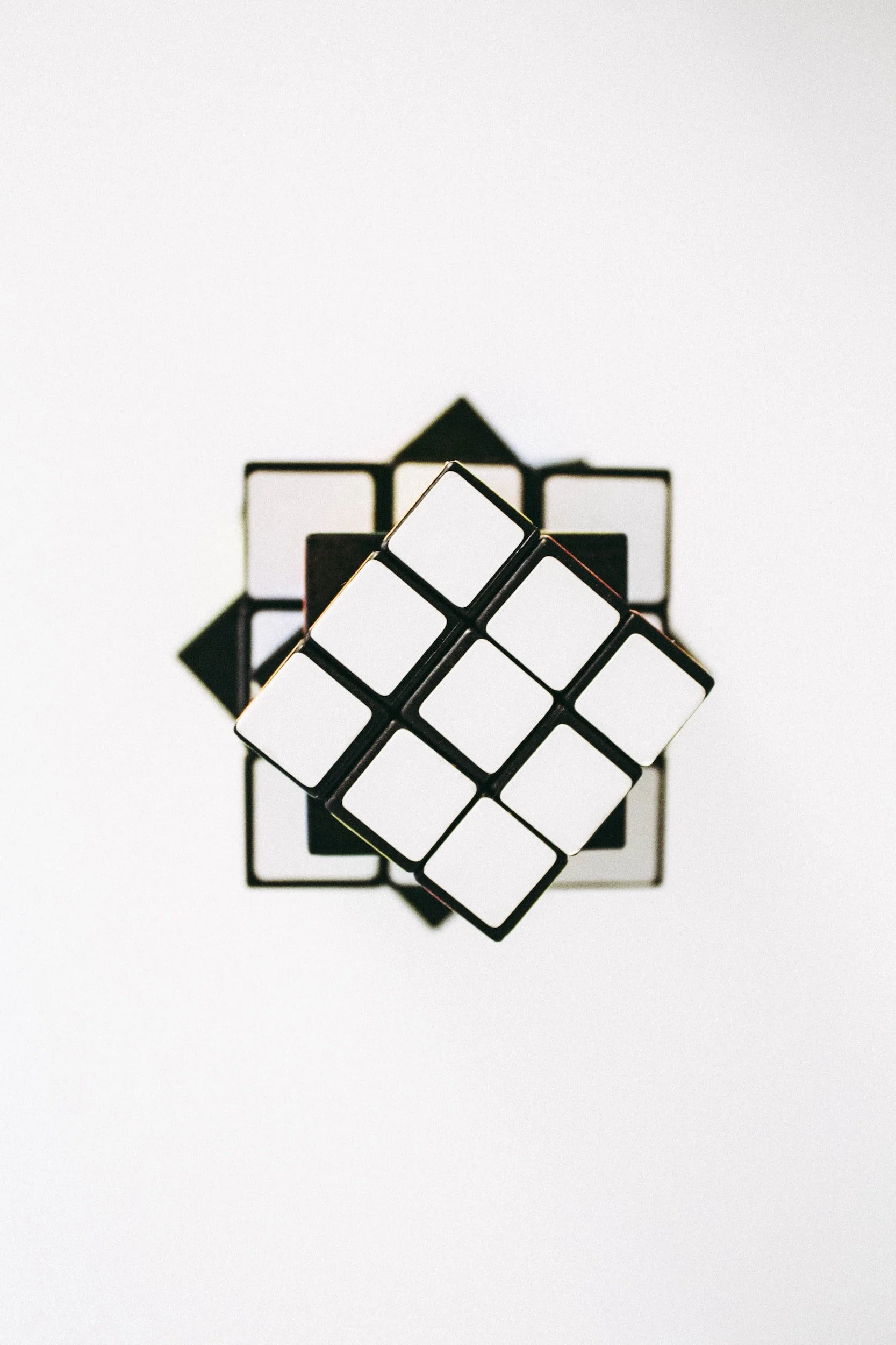
We refreshed the app with white UI to reflect the white Mamava pods and to incorporate a more relaxing vibe for the user.
Search
Backend: Search recognizes and auto-fills common phrases like “Atlanta Airport.” The search radius begins at 5 miles and expands by 5 miles until a location is found (up to 25 miles). A pin is dropped on the map at the location the user searched.
UI: Navigation patterns are consistent across screens. UI is updated and streamlined. Map pins improve the distinction between Mamava pods and lactation spaces. Location cards are consistent on every app screen. We added 3 new map states for “zoomed out too far” “Redo search in this area” and “No locations” to better inform the user.

Access + vacancy alerts
The existing access overlays only covered half the screen and created confusion. We designed a full-screen overlay so the user can identify the unlocking CTA without being distracted by other content.
The vacancy alert request flow uses the same pattern as access to create more cohesion in the app for the user.

Access + vacancy alerts
Reduce confusion and friction in the unlocking process and the request-a-vacancy-alert process to entry faster for our users.

UI + patterns
The app lacked consistency across screens and functions and the dark UI needed an overhaul to bring it into alignment with the brand users’ expectations.
Two audiences
Buyers supports the business, but parents are the brand’s inspiration. The company strives to support both but doing do on one website creates messaging and prioritization difficulties.
No pricing
Most potential buyers visit the website looking for pricing, however, there was concern that publishing this information could reduce inbound leads.
Limited product photography
Product photography was not consistent, or certain features had not been captured. We needed to create a design system buoyed by illustration, graphics, and typography.
No development team
The old site was built on Squarespace 7.0. There was no budget for developers and time prohibited us from upgrading to the newer version of Squarespace.
Focus on sales leads
Clarify our primary call-to-action for buyers so we could better interpret our analytics and increase leads for our sales team.
Introduce Design Patterns
Our goal was to create a design system made up of consistent atomic parts, patterns, and templates to increase harmony on the site.
Elevate product superiority
Organize and amplify Mamava’s unique selling propositions to distinguish the product from other competitors.